
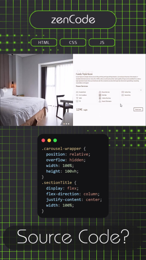
A hotel room showcase component built around a clever two-level navigation idea. The outer carousel lets visitors browse between different room types, double room, family room, luxury suite, while inside each slide, a second carousel cycles through multiple photos of that specific room. All in one smooth, contained layout.
Next to the photos, each slide presents the room name, a short description, a clean grid of amenity icons and a price per night, plus a "Book now" button ready to link wherever you need it. Everything is laid out to feel like a mini room page, not just a gallery.
The whole thing works with arrow navigation on desktop and is fully responsive for mobile. A great fit for any hotel, guesthouse, or vacation rental site that wants to present its rooms in a way that actually makes people want to book.
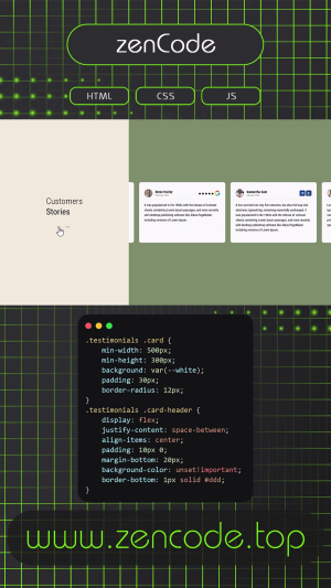
A clean, two-panel testimonials section that lets your customers do the talking. On the left, a calm gold-tinted panel holds the section title and a pair of navigation arrows. On the right, review cards slide in smoothly one by one, each showing a real face, a name, a date, and the rating from the platform it came from, whether that's Google, Booking, or Airbnb.
The carousel moves on its own, pauses when someone hovers over it, and responds naturally to swipe gestures on mobile. Navigation arrows give users full control whenever they want it. The layout adapts gracefully from wide desktop screens all the way down to small phones, stacking into a single column without losing any of its polish.
A ready-to-drop-in component for any hospitality, travel, or service-based website that wants to show off its reputation without making a big deal out of it.
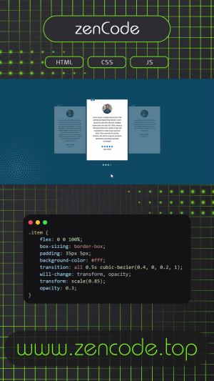
This project is a responsive and modern testimonials carousel built with HTML, CSS, and JavaScript. It features a smooth infinite-loop slider that automatically cycles through testimonial cards, while also supporting manual navigation through dots and touch swipe gestures for mobile devices.
Each slide includes a customer photo, quote icon, star rating, and testimonial text, styled with a clean centered layout. The active card is highlighted with a scale-up effect and stronger opacity, while surrounding cards appear smaller and faded to create a depth-focused carousel look.
The slider adapts across breakpoints, showing 1 item on mobile, 2 on tablets, and 3 on desktop. It also includes pause-on-hover functionality and smart transition handling to prevent visual glitches during infinite looping.
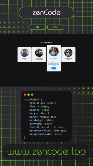
This project presents a modern and engaging way to showcase team members using interactive hover-based cards. Each team block starts in a compact layout and smoothly expands on hover, revealing additional details such as role description and a call-to-action button.
The design combines soft blur effects, rounded cards, and subtle transitions to create a polished, professional look. Profile images animate slightly on hover to enhance visual feedback, while the layout remains responsive and adaptable across screen sizes.
Built with pure HTML and CSS, this component requires no JavaScript and is ideal for corporate websites, agency pages, or personal portfolios where team presentation needs to feel both elegant and interactive.
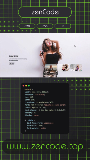
This project is a sleek, modern image carousel built for flexibility and flair. Each slide features a full-screen background image with an overlay of content that subtly fades in—making it great for portfolios, landing pages, or product showcases.
Users can manually scroll through slides using stylish Bootstrap Icons, or just sit back and let the automatic slide transition do its thing every few seconds. On top of that, the layout is fully responsive, adapting seamlessly to all screen sizes—from wide desktop views to compact mobile screens.
Whether you're presenting visuals or telling a story, this carousel keeps your content moving—literally and visually.